From bento grids to glassmorphism to AI-generated interfaces, design trends shift fast. Here's our take on what's genuinely useful vs what's just aesthetic noise in 2025.
Every year brings a wave of visual trends that sweep through Dribbble and Behance — and eventually find their way into real products. The challenge is separating trends that improve usability from trends that just look good in portfolios. Our design team evaluates trends through one lens: does this help users accomplish their goal faster?
Trends We're Actually Using in Client Products
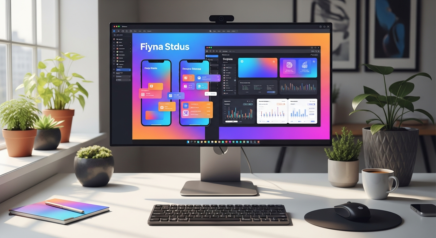
- Bento grid layouts for data-dense dashboards — excellent for scannability
- Variable fonts for responsive typography across device sizes
- Micro-interactions tied to real state changes — not decorative animations
- High-contrast, accessible color systems as a default, not an afterthought
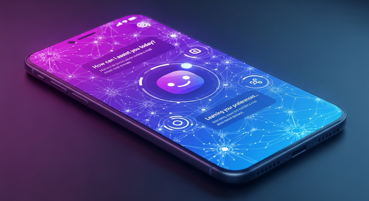
- AI-assisted design systems — using tools like Galileo to generate component variants
Trends to Use Carefully
- Glassmorphism — beautiful but creates contrast accessibility issues in complex UIs
- Neumorphism — poor contrast, not WCAG compliant in most implementations
- 3D hero elements — can significantly impact load performance on mobile
- Skeuomorphic comeback — works for specific contexts (calculator, audio apps) but is overused
What We're Prioritizing in Every Project
Accessibility (WCAG 2.1 AA minimum), performance-aware design (no effect that costs more than 50ms), and system thinking (components that scale, not one-off screens). The best design work is invisible — it just works.
First Code Technologies' design team produces full Figma design systems for every client engagement — not just screens. We deliver component libraries, interaction specs, and accessibility audits as standard.
Neha Bose
UX Director, First Code Technologies
Published October 22, 2025